Brand Identity Examples for Business
Last Update: 30 March 2022
One of the best ways to create an effective brand identity is to learn from the very best that already won the world with its brands. Today, we take a look at some of those winning brand identities and rebrand designs. And talk about what makes them effective.
If you’re a business owner, you’ll learn a lot of useful things from this guide. First, let’s start with the very basics.
What is Branding Identity

Brand Identity is the visible elements of a brand, such as color, design, and logo, that identify and distinguish the brand in consumers’ minds. Brand identity is distinct from brand image. The former corresponds to the intent behind the branding, while the latter corresponds to the perceptions of the audience. Brand identity is a set of individual components, while brand image is the impression in consumers’ minds and how they remember the brand.
A strong brand identity can be an important asset for companies when entering new markets. When people become familiar with a brand name and its visual representation, they are more likely to choose a product if they have already been exposed to it before. This can be extremely beneficial for companies who are expanding into new markets or going global.
Why Is It Important?
One of the major benefits of having a brand identity is to help build customer trust and loyalty.
If your customers see a consistent style and design across all your brand promotions and products, they will quickly recognize you and trust your brand.
Remember how McDonald’s uses the same colors, fonts, logo, and shapes across all their brand campaigns, ads, billboards, packaging, and even in their restaurants? It helps their customers to instantly recognize their brand. If you want to do business with someone, you’ll always prefer to do business with someone familiar rather than a stranger because it’s more comfortable. And this concept applies to your customer preferences as well.
McDonald’s knows that they are already familiar with their customers. So they keep it simple with their brand identity – just yellow golden arches on red background. And it works. They don’t need to create any fancy logos or colors just to get attention because they already have the attention of the masses through their consistent branding efforts over the years.
Main Elements of a Brand Identity

It’s difficult to describe a specific set of elements for a brand identity. Because each brand has its own unique qualities. For example, creating branding elements for mobile apps and user interfaces are part of digital startups and companies. You can read more about How To Develop A Strong Brand Identity to understand how to develop a strong brand identity.
Either way, these are some of the main elements you should have in every brand identity design:
Logo
The logo is the visual representation of a company’s name, it can be a symbol or lettering or a combination of both. It’s part of the basic identification that people associate with your company.
Business Cards
A simple and cost-effective way to make your company stand out from others is with a well designed business card. It shows potential clients that you care about quality in everything you do.
Stationery
Letterhead and envelopes help you build credibility with potential clients by making your business look official and well established.
Brochures & Flyers
Brochures and flyers are great tools for informing potential customers about your products, services or events. They can also be used as promotional tools for special deals or discounts.
Catalogues
A catalogue is an organized collection of images, text and other information about products being sold by a company. This helps organize all the details in one
5 Top Brand Identity Examples
There’s one thing common with all these amazing brand identity designs—They are all crafted with passion and after thorough research. You’ll notice it instantly. Have a look.
1. Coca-Cola
When you hear the name Coca-Cola, you probably picture its well-known logo, shown above.
But you also might think of the polar bear, the color red, its “Share a Coke” campaign, or the classic ribbon-like imagery featured on its cans. Here are two things that comprise Coca-Cola’s brand identity:
Visual elements: These are the types of design pieces that most people think about when they hear the term “brand identity.” The logo is obviously one of these visual elements. But there are others, too. For example, Coca-Cola makes extensive use of the color red in all of its branding and marketing efforts. This consistent thread ties everything together visually for the company — from ads to packaging to billboards — making it instantly recognizable around the world.
Tonal elements: You can’t see these elements, but you can feel them. They’re how a brand communicates with an audience — through things like language, tone of voice and even music when applicable. For example, if you’ve ever seen ads for Coca-Cola using polar bears as mascots, you know they’re fun and friendly. It’s a lighthearted approach that mirrors the product itself — a refreshing soft drink that’s often enjoyed during parties or celebrations. In fact, they just released another ad featuring polar bears at Christmas!
2. Dropbox
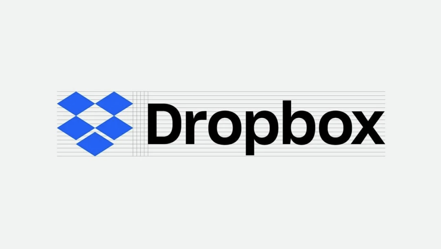
Dropbox is a great example of minimal brand identity designs. It uses a strict color palette limiting most of its designs to 2 or 3 colors.
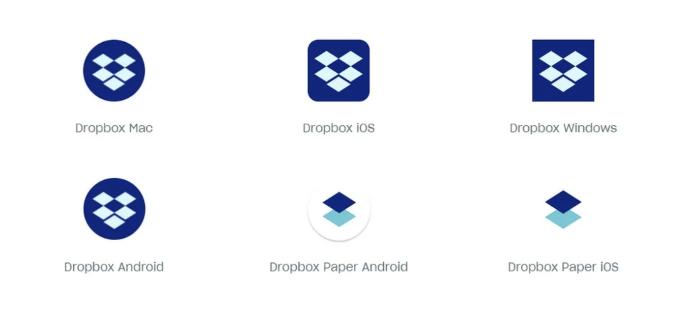
One aspect you’ll notice in this brand identity is its approach to designs in different platforms. For example, you’ll notice that Dropbox uses different shades of the color blue in desktop and mobile app brandings.
The result is a beautifully consistent brand identity that works well across platforms and devices.
3. Asana

Asana’s mission is “to help humanity thrive by enabling the world’s teams to work together effortlessly.” The founders began at Facebook, where it was clear that they needed a project management and collaboration tool that would enable the teams to work together more fluidly.
In Sanskrit, “Asana” refers to a specific pose in which yogis sit, and the company name is in homage to the Buddhist principles of focus and flow. This, along with their values of “doing great things, fast” and teamwork, is manifested clearly in their visual brand, as well:
- Their logo typeface is optically adjusted so that the lines of text appear even (even though they technically aren’t). This suggests harmony, giving a sense of calmness as well as efficiency.
- They consistently use rounded corners on all design elements. These soft edges contribute to a feeling of approachability.
4. AirBnb
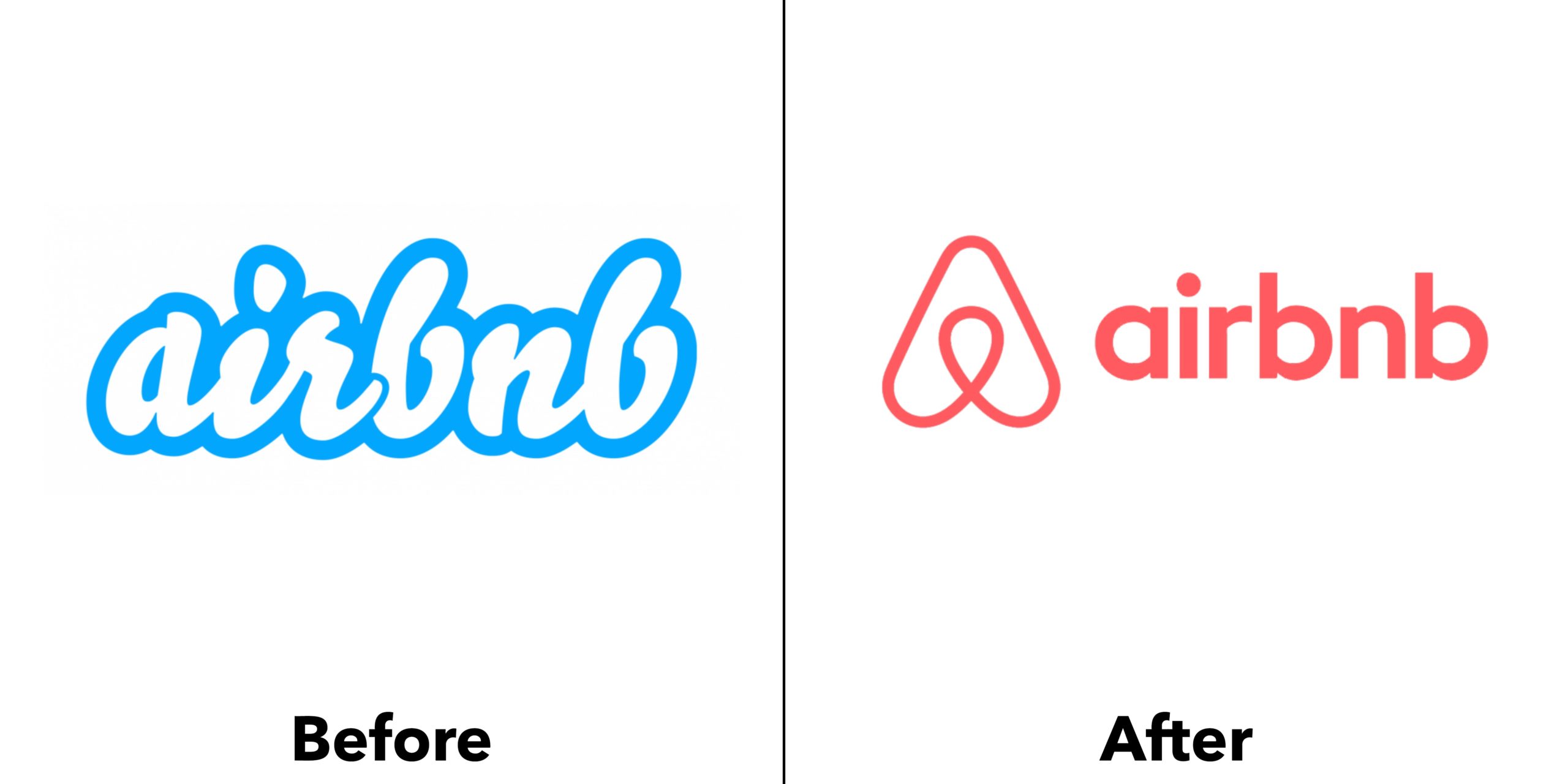
The Airbnb logo is not just a marker of the company, but a symbol of belonging and a feeling of home.
In 2014, Airbnb worked with DesignStudio to update their brand identity. The agency focused on incorporating the international, friendly, adventurous and belonging nature of Airbnb. This meant simplifying the logo from words to just an icon, eliminating language barriers and making it universally recognizable. By incorporating a large palette of colors and a variety of photography styles, any culture or country can now identify with the Airbnb brand.
5. Spotify
Spotify is one of the world’s most popular music-streaming services. Its brand identity, which is as understated as the service itself, is a reflection of its mission: to let the music speak for itself.
For a brand that puts music front and center, Spotify’s has a rather subdued visual identity. A modest color palette of green, black and white takes a backseat to the colorful album covers played on the streaming platform. The minimalist logo, which includes three horizontally curved lines in a circle, represents sound’s flow and movement. Look closely, and you’ll notice it’s crooked, bringing a humanistic feel to the brand.
Conclusion
For now, you should have all the tools you need to create a great brand identity for your business. Remember that consistency is key when it comes to branding. Every aspect of your business should reflect your company’s values and goals—even if that means that you’ll have to be flexible from time to time.
Do you have any questions about creating a brand identity? If there’s anything we can do to help, please contact us. We’d be happy to assist you!
Let’s Talk!
If what you see here is relevant for you and can help you grow your business or organisation, we’d love to discuss further with you. Drop us a message or schedule an appointment with us.
