
1. What is Branding Guidelines
2. Element of Branding Guidelines
3. 12 Branding Guide Examples
Crafting a cohesive brand identity is a demanding task. Brand guidelines serve as essential directives for graphic designers, web developers, and marketing agencies tasked with ensuring that products and services present a unified image as if originating from a single entity.
Despite their critical role in maintaining the integrity of your identity across all public-facing platforms, many businesses neglect to deliberately design these guidelines, or even contemplate their potential utility until it’s significantly too late.
In this article, we will explore the concept of brand guidelines, delve into the components of a style guide, and present some exceptional examples of branding guidelines.
What Are Branding Guidelines?

Branding guidelines are essential documents that function as a detailed roadmap for preserving a consistent and cohesive brand identity.
They are the codification of a brand’s visual, verbal, and experiential elements, collectively shaping a brand’s personality, values, and aesthetics.
From colour palettes and typography to logo usage and tone of voice, branding guidelines offer a set of clear instructions that enable both internal teams and external partners to accurately represent and uphold the brand’s essence.
Companies like Apple and Coca-Cola have built massive empires by carefully defining their brand identities and maintaining them through precise brand guidelines.
The Elements of a Branding Guidelines

A thoughtfully crafted logo is a vital part of any business’s identity, yet it represents merely a single fragment of the broader branding mosaic.
A brand style guide extends far beyond the confines of a logo. It visually encapsulates the essence of your brand, right down to the core purpose of your business.
Here are some pivotal elements that can either elevate or undermine a set of branding guidelines:
| Element | Description | Importance |
|---|---|---|
| Logo | The visual representation of the brand | Crucial for brand recognition |
| Color Palette | The set of colors representing the brand | Evokes emotions and brand perception |
| Typography | The style and appearance of printed matter | Affects readability and brand personality |
| Tone of Voice | The brand’s consistent style of communication | Influences brand personality and customer perception |
Next up, let’s explore 12 awesome branding guidelines examples that you can use as inspiration.
12 Branding Guide Examples
1. Starbucks
The Starbucks guide is an excellent example of what to include in your guidelines. The entire book is exquisitely designed and arranged.
It utilises simple layouts that are not overly cluttered or complex, allowing the reader to concentrate on the content.
Moreover, the images used are of high resolution and printed on fine paper, which enhances the quality and value of the printed edition.
This guide employs a considerable amount of white space to maintain a clean and easily readable format.
The sections are clearly demarcated and straightforward to comprehend. There is also an abundance of colour throughout the entire book, making it a very agreeable experience for the readers.
The guide commences with an overview of the Starbucks brand, encompassing its values, mission, vision, and personality.
It then delves into detail regarding all the visual elements: typography, colour palette, logo variations and usage examples, photography guidelines, iconography, packaging design and everything else one might envisage when crafting elements for a Starbucks brand expression.
2. Uber
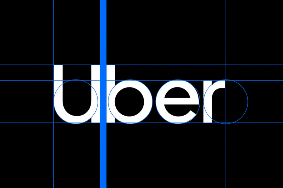
The company behind the popular ridesharing app, Uber, has prepared a comprehensive set of brand guidelines to help their marketing and product teams communicate with their audience consistently.
The system of Uber is very comprehensive and covers everything from the brand story, to how to use the logo, typography and colors to create new graphics.
The Uber brand system is composed of 9 core elements:
- Logo
- Color
- Composition
- Iconography
- Illustration
- Motion
- Photography
- Tone of voice
- Typography
3. Youtube
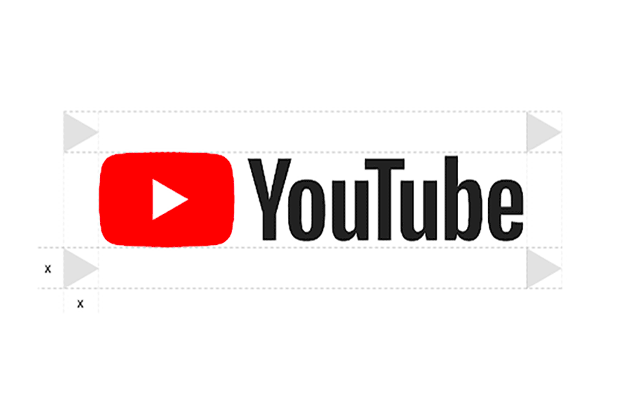
YouTube calls its guideline “Brand Resources”.
The Youtube brand resources page contains 4 brand elements.
1. Logo and icon
2. Colors
3. Typography
4. Imagery
4. Audi
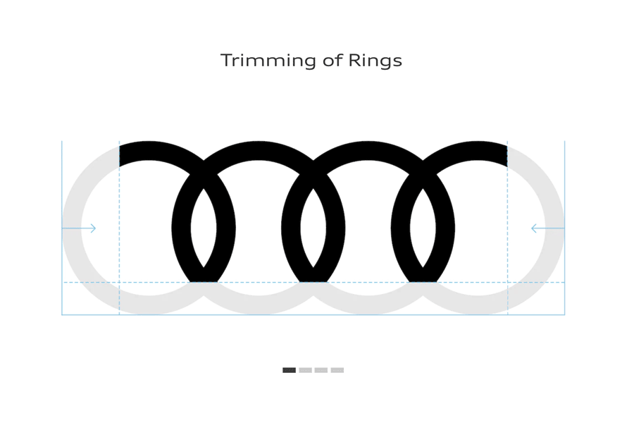
The online version of the Audi corporate identity manual is a must-see. It’s one of the most detailed and well-structured brand guidelines examples we’ve come across.
The front cover features the Audi logo, which sits in the middle of a white page. The following pages describe the new logo in detail: its shape, proportions, colors, spacing and typography.
The manual also goes into great detail about the various uses of their visual identity and shows how Audi applies it to different media.
The brand guidelines include many examples of advertising and marketing campaigns that use their signature look. Some of them are just simple images or ads while others show how Audi uses its visual identity in a broader context.
This corporate identity guide also explains how to apply color to different areas and how to use it in motion graphics.
Moreover, it contains detailed information on the typeface and explains how to use it in web design and other applications.
5. Instagram
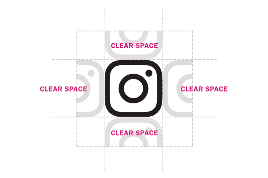
Instagram is the most famous example of a visual brand, so we couldn’t leave it out of this article.
The Instagram brand guidelines consist of two extra sections: one with screenshot template and the other with broadcast template.
The Instagram style guide is also specific (just like Spotify) but much simpler—it only describes the basics.
Mainly you will find how to use the Instagram logo, the glyph (black/white version), and the above mentioned two templates.
You’ll also find links to download the logo and templates.
6. Spotify

Spotify’s brand guide is one of the most extensive ones. It doesn’t only talk about logo, colors and typefaces but also describes how to use Spotify app.
The Spotify design guidelines have been created to ensure that all Spotify users receive the same delightful user experience.
For the most part, the Spotify style guide talks about how to present content on the app: album artworks and metadata.
The guide also describes browsing and linking to Spotify, how to design playing views and other specific elements to Spotify app.
7. Cisco
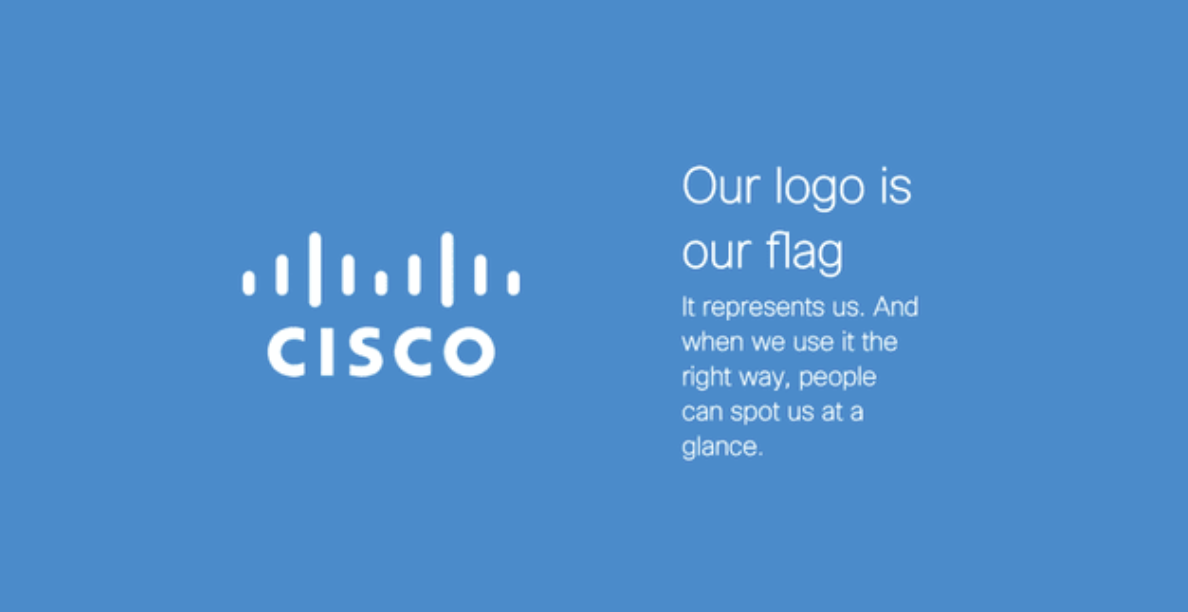
Cisco’s style guide isn’t just a guide — it’s an interactive brand book. The company takes website visitors page by page through its brand’s vision, mission, strategy.
And even its promise before showing users its logo and allowing them to actually type using their proprietary typeface, “CiscoSans.”
Where’s Cisco’s color palette, you ask? The business has a separate webpage for just that.
The best part of Cisco’s brand guidelines is that the company uses an easy-to-follow tone. It might be one of the largest companies in the world, but Cisco doesn’t show off on its site.
Instead, it shows users how they should expect to interact with the brand when they visit Cisco’s social media channels or see advertisements.
The guidelines also provide a detailed overview of the company’s color palette, typography, and other design elements.
8. Slack
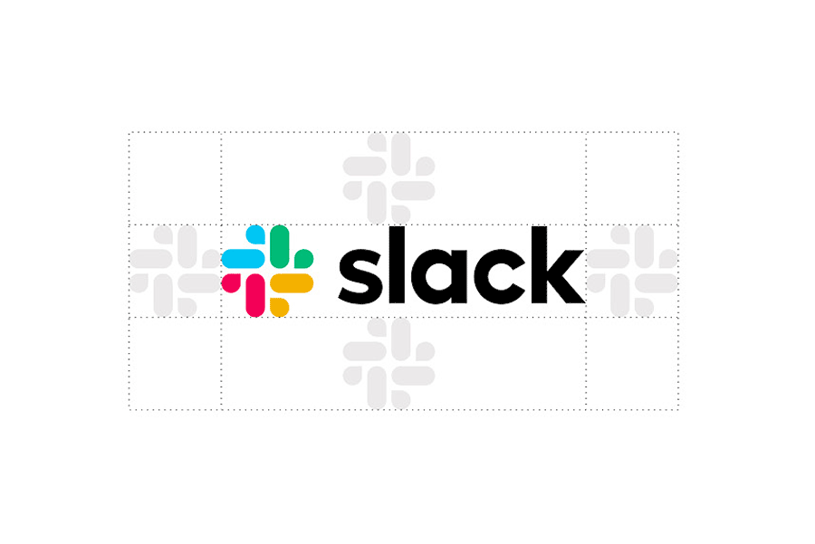
Slack’s brand guidelines are well-organised and easy to navigate.
In the first section you’ll find elements the intangible elements that define the brand like: core values, personality and tone fo voice.
The Slack guidelines cover 7 elements:
- Logo
- Colors
- Typography
- Brand Architecture
- Illustrations
- Icons
- Photography
9. Netflix
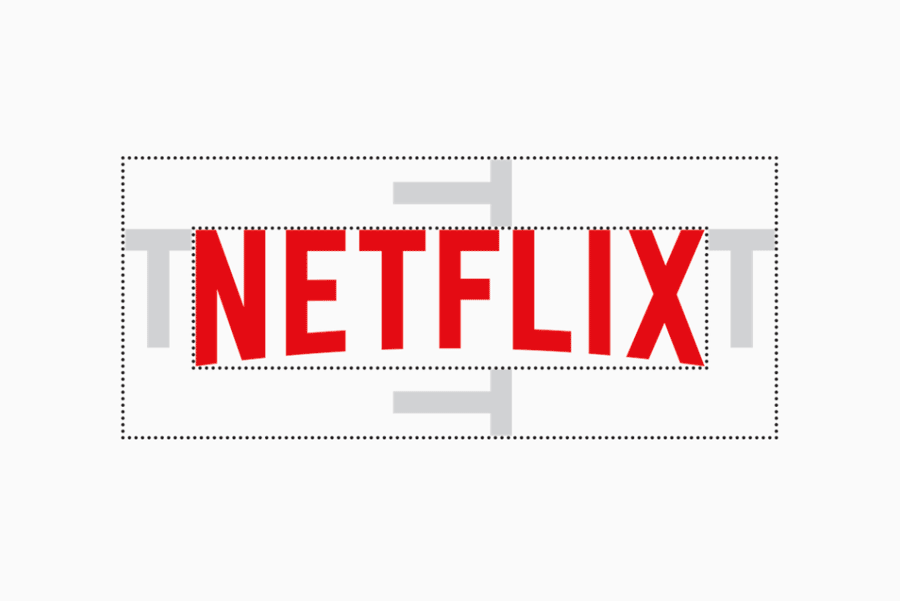
Netflix’s guidelines are nicely organized and visually appealing, which makes them more enjoyable to read. The logo section shows how the logo should be used and not used.
The symbol section mostly focuses on the “N” symbol and its various uses.
The color section is well structured and easy to understand with a lot of examples.
This style guide contains absolute minimum elements of the brand’s visual identity like logo versions, colors and how to use it on media.
You’ll also find what to avoid, plus other considerations and rules to ensure proper use of the brand assets. The Netflix guidelines cover 3 essential elements:
1. Logo
2. Symbol
3. Colors
10. Dropbox
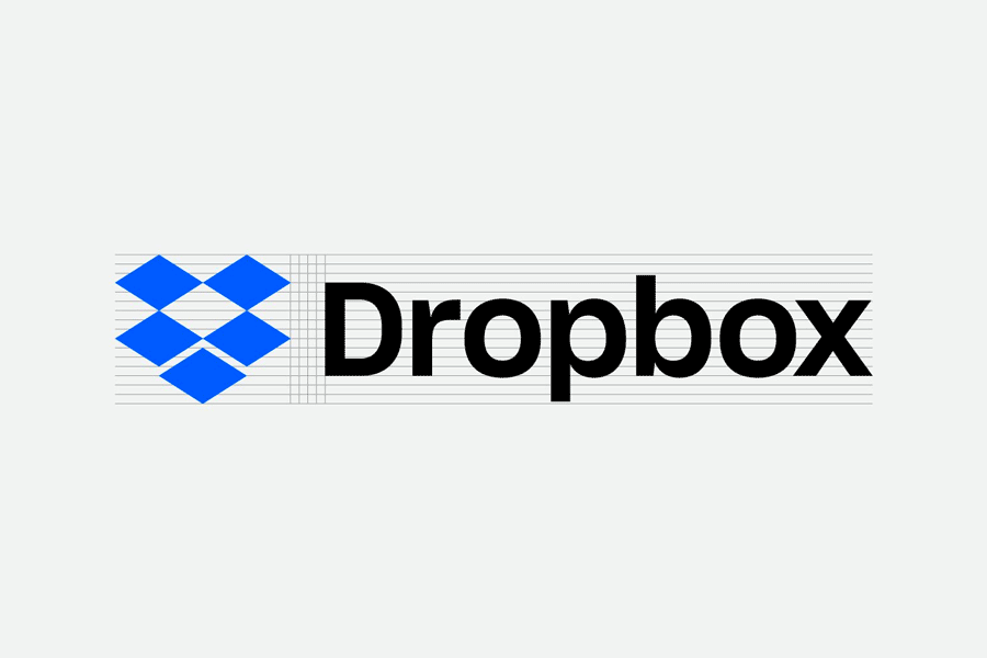
Dropbox is a file hosting service that offers cloud storage, file synchronization, personal cloud, and client software.
The Dropbox style guide is a simple page but it guides you clearly on how to use the logotype, brandmark and other brand assets.
It also contains other product logos, do’s and don’ts, application icons and product screenshots.
The Dropbox brand guidelines cover 7 elements:
- Logo
- Color
- Typography
- Writing
- Visuals
- UI
- Motion
11. Zendesk
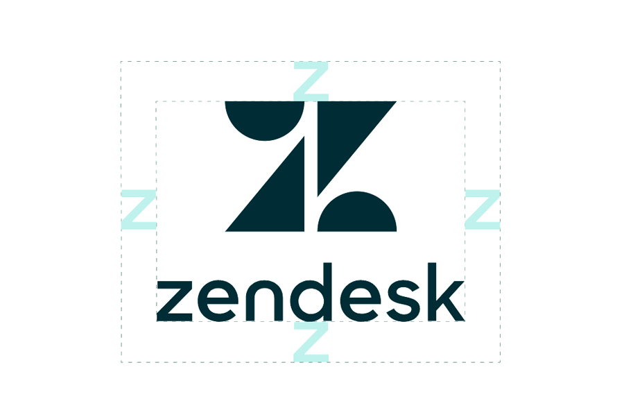
Zendesk is a company that makes customer service software. They have a great brand guideline that demonstrates how to use their logo, typography, color and other elements of the brand.
Zendesk Brand Guidelines
The Zendesk brand guidelines has been developed to ensure that writing, visual style, design, videos—essentially everything we make works together to deliver a consistent message.
The opening pages talk a bit about the brand attributes and messaging.
In the design part of the guide you will find standard things like:
- Brand identity
- Typography
- Color
- Layout
12. TikTok
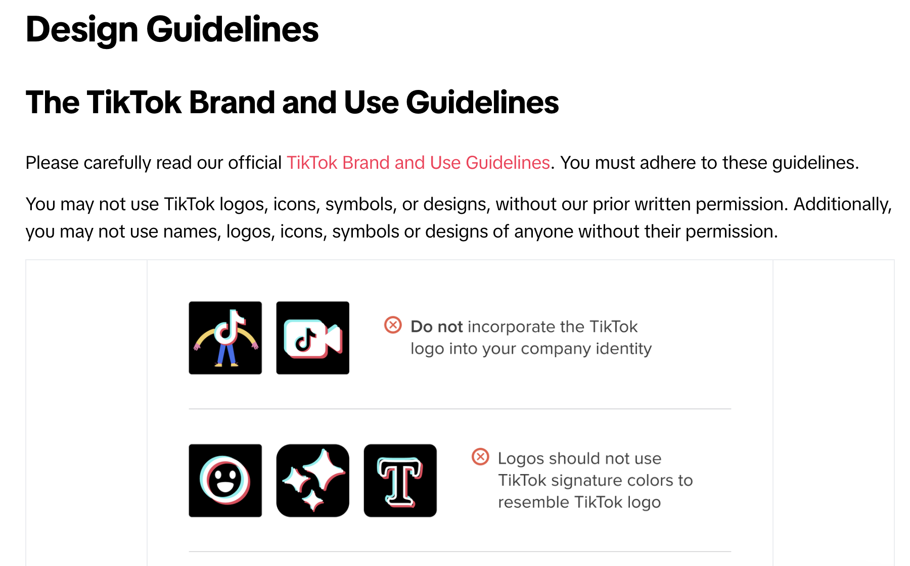
The TikTok brand guidelines commence with a few preliminary pages that articulate the brand’s ethos, the underlying design concept, and the inspiration behind it, which is quite intriguing!
Naturally, they also addressed the fundamentals, such as:
1. Logo: Detailed specifications on how to use the TikTok logo, including size, spacing, and what not to do.
2. Co-branding: Guidelines on how to pair the TikTok brand with others, ensuring consistency and brand integrity.
3. Color: A breakdown of the brand’s color palette, including primary and secondary colors, and guidance on their usage.
4. Typography: Information about the typefaces used by TikTok, including fonts, weights, and styles.
In essence, it’s a straightforward style guide, yet it encompasses all the necessary details you require to authentically manifest the TikTok brand.
Conclusion
Branding guidelines are useful in many ways, including keeping all team members on the same page.
A branding guide can allow anyone in and out of the company to contribute and keep one from making a mistake. It’s important when developing an effective brand is to stick with your vision, so that your communication materials and your product work together to reinforce your brand.
If you’re looking to hire an Agency who can help you build a branding guidelines, Neu Entity here to help.
Schedule a consultation with us and we’ll get started on building a branding guide that will make your content stronger and more effective than ever!
Let’s Talk!
If what you see here is relevant for you and can help you grow your business or organisation, we’d love to discuss further with you. Drop us a message or schedule an appointment with us.
