A well positioned product on the marketplace can outsell others with a higher price tag, based on trust and credibility of the brand alone. Even after purchase, an attractive interface will have 59% retention rate, while 53% will stay at least 6 months if they like your design. Therefore, if customers feel confident about your brand, then you are on your way to long-term success.
What Is Brand Visual Identity?
Brand visual identity is the combination of all elements that make up a company’s visual brand. It includes logo, colors, typography, photography, and more.
Visual identity is what makes a company’s products or services unique and recognizable among the competitors. It allows customers to instantly recognize a brand and associate it with certain values and expectations.
Brand visual identity also helps companies in differentiating themselves from their competitors by creating a strong connection between their brand and their target audience.
A strong brand visual identity helps companies create an emotional bond with their customers by conveying key values and messages through visuals.
What You Need To Do Before Creating Visual Identity For Your Brand
In order to create a strong visual identity for their brand, business decision-makers should define several aspects of their business.
Doing so will shed more clarity on the process, especially, on the desired outcome and final result.
Here are the four factors that will help the creation of your brand’s visual identity.
1) Define The Brand’s Personality:
The personality of your brand is what defines its tone, style and voice. It is also what differentiates it from other brands in the industry. It helps consumers understand who you are as a company and what kind of experience they can expect when dealing with you or using your products or services.
2) Define Your Target Audience:
Knowing who your target audience is helps create a stronger bond between them and your company. This way, they can better understand why they should buy from you rather than any other business out there. Knowing who they are also allows you to come up with marketing strategies that cater to their needs and wants instead of just throwing random ads at them hoping that something sticks to your ads
3) Define What Makes You Unique:
What makes you unique from other companies in the same industry? If there are similarities between other companies in the same industry, what makes yours stand out from theirs? This is important because if there are too many similarities between brands then customers may get confused about who does what and why they should buy from one company over another.
4) Create A Brand Persona:
A brand persona is a fictional character that represents your brand’s personality. It should be based on real people so it feels natural to consumers but it should also reflect your company’s values and culture. The best way of creating a brand persona is by asking yourself questions like “If my company was a person, who would it be?” or “What type of person do we want our customers to think about when they think about us?”.
4 keys Elements Of Visual Identity For Brands
1. Logo
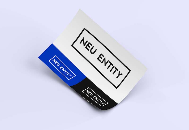
A logo is a visual representation of branding and a graphic symbol of your business and its identity.
Brand’s logo should consist of imagery that is memorable and stick into the minds of those who see it. It should also convey what your business does.
A professional logo design will not only make your brand stand out from the crowd, but it will also help you establish trust with your customers and clients.
The main purpose of a logo is to represent the company’s name and brand. However, logos can be used for other things as well such as representing an idea or concept that the company stands for. They can also be used as part of advertising or marketing campaigns to create awareness about a product or service among potential customers and clients.
2. Color Pallate
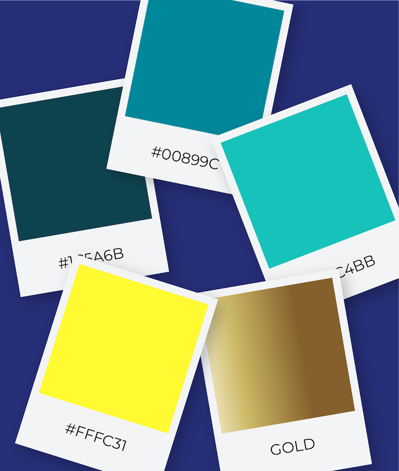
The right selection of colors —your brand color palette— can carry different connotations and can elicit different emotions. Some colors are even culturally specific. When choosing your color palette, think carefully what emotions you want to evoke, what audiences you’re addressing and all your needs: website and online social presence; corporate, employee and investor communications; reports, brochures, sales tools and presentations as well as print materials.
Here are some tips to help you choose the right colors:
- Define your audience.
- Explore mood boards.
- Consider how colors look together
What does each group need from your brand? What do they like or dislike about it?
Mood boards are collages of images that represent the moods and aesthetics you want to create with each communication piece. They help you visualize how color combinations might work together before making decisions about how to use them in a design project. Mood boards can be physical or digital and should include images from magazines or websites that inspire your design choices. In the case of color palettes, try using a tool like Adobe Color CC .
When applied to different backgrounds, text and imagery. When choosing colors for your brand, think about how they will look on different backgrounds such as white or black, with text of varying shades, or mixed media like photographs or illustrations. You may find that certain combinations work better than others depending on where they’re placed within an image.*
3. Typography
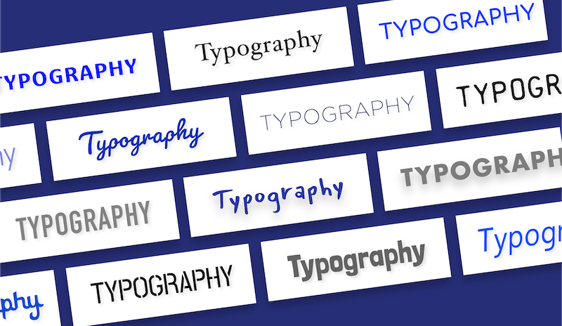
Typography is your brand’s visual voice and tone conveyed through the shape and style of your text.
There are many font choices. Some fonts are tried and true and classic (Garamond’s origins are from 1500s France), and other fonts are trendy or techy. Choose font families that reinforce your brand attributes. Ideally, you’ll use your brand fonts consistently and, in addition to color, the typography will serve as a unifying element to your brand.
Typography is important because it conveys how you want people to feel about your company or product. The font family should be selected based on how well it works with the design elements of your website — not just because it looks cool or is trendy. It should also align with how you want people to feel about your company or product. For example, if you run an accounting firm, maybe Garamond is not the best choice for its formality; consider something more modern like Proxima Nova instead.
4. Imagery

A picture can speak more than 1,000 words when chosen carefully and aligned with the other elements of your brand’s strategy, look and feel. Clean and spare? Then your photographs should be, too. Cozy and homey? Same with your photographs or illustrations.
Whether you create imagery or purchase stock, you should opt for a consistent style or treatment that complements the tone of your other elements.
Here are some tips for creating great imagery:
- Choose images that tell your brand story.
- Respect copyright laws.
- Use high-quality images whenever possible.
What does your company stand for? What do you want to convey about yourself? Choose photos that align with those messages — whether they’re photos of people using your product, or photos that showcase the environment surrounding it (such as nature shots or urban landscapes). This will help visitors connect with what matters most to you as a business.
Don’t use copyrighted photos without permission from the owner or creator of said photo. If you find a great image online, Google reverse image search can help you find out if someone has already used it elsewhere online. If so, you should avoid using it unless you get permission from the original photographer or creator.
Low-resolution images make for poor quality visuals on screens and smaller devices like mobile phones and tablets. Try using high-resolution images whenever possible; this will ensure your site looks crisp and sharp on any device used to view it — from desktop computer monitors to mobile phones!
5. Graphic Elements
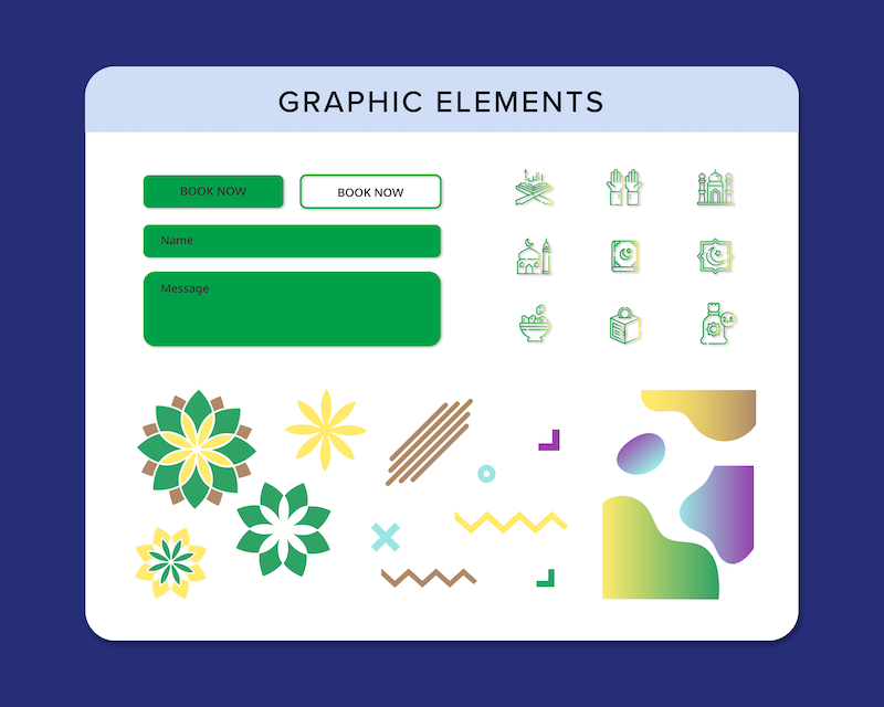
Graphic elements and visual language are the foundation of your brand’s visual identity. Each element and aspect of your visual language should create a cohesive system is spread across your company’s physical and virtual presence. The use of graphic elements— icons, color blocks, chart styles, infographics—can signal and reinforce your brand. The amount of white space versus content, the size of the images and where the elements are placed on the page grid all work to prioritize the information for the audience by drawing their eyes to different areas of the page.
Example of Graphic Elements:
- Color blocks
- Icons
- Chart styles
- Visualization
- Borders
- Shapes
Color blocks are great for highlighting important information or creating hierarchy on your website or marketing materials. It can also help to direct visitors when they’re browsing through pages with a lot of content.
Iconography is one way you can communicate quickly and easily with customers who may not be familiar with your industry or product lines. Icons are used frequently in e-commerce sites like Amazon because they allow shoppers to quickly identify products they need without needing to read lengthy descriptions first.
Charts help tell a story visually so that customers can understand complex concepts faster than if they were presented in text only.
Visualization can be used to communicate ideas more effectively and increase understanding.
Borders are used to separate elements and create visual boundaries between sections of a website, as well as guide visitors on how to navigate the site. They can also be used to create a sense of order in your designs, by adding lines and boxes around different elements on your page.
Shapes like squares and circles can be used to bring some interest into otherwise boring designs. They can be used to highlight important information, or placed around images or text for added emphasis (see above). You could even use them as backgrounds in place of solid colors.
Conclusion
Ultimately, the most important takeaway is that you’ve considered a visual identity for your brand, which is the first step towards truly understanding and implementing your overall strategy. No design effort will be wasted on a comprehensive and consistent branding plan. And ultimately, that is what we at Neu Entity want to help you do.
Let’s Talk!
If what you see here is relevant for you and can help you grow your business or organisation, we’d love to discuss further with you. Drop us a message or schedule an appointment with us.
