ASF
BROCHURES / BANNER / WEBSITE / T-SHIRT

Revamping the logo
The current logo was well thought off, it just required a bit of refinement.
The reason we refine the logo to make it balanced, symmetrical and match the stylescape.
Following the previous definition of the logo, we retain all the elements.
Adding to that, incorporated the main brand attribute of “togetherness”.
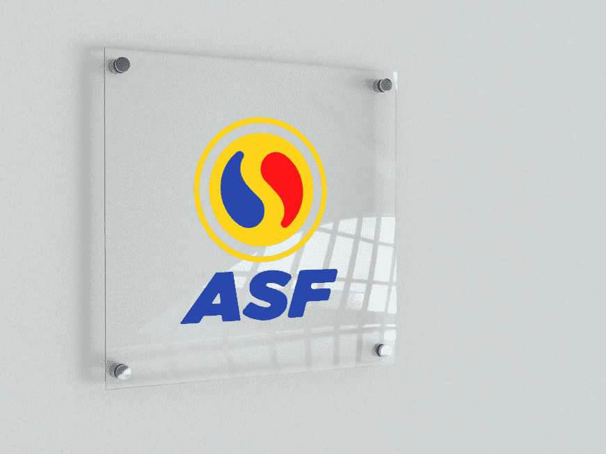
The outer yellow line symbolises a protective layer around the world which
is a symbol for how As Soleh Foods will care for their agents.
Shorten “As Soleh Foods” to the letters “ASF” for easy recognition
The letters ASF are bold fat and leaning to the right to show that ASF
is a solid brand and are forward in their thinking.
Before
After
Scability

Logo Research
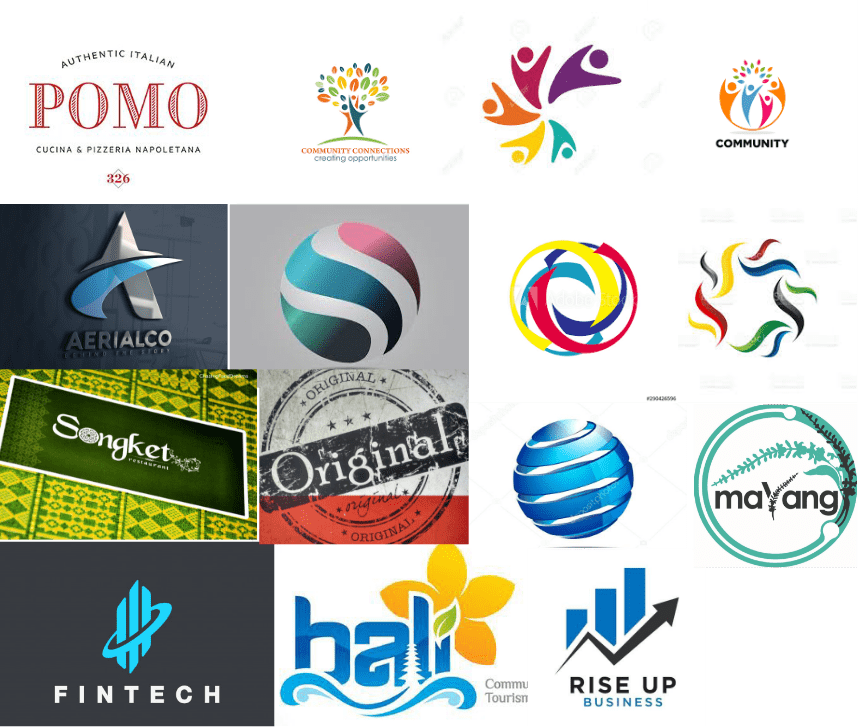

Propose Logo Design
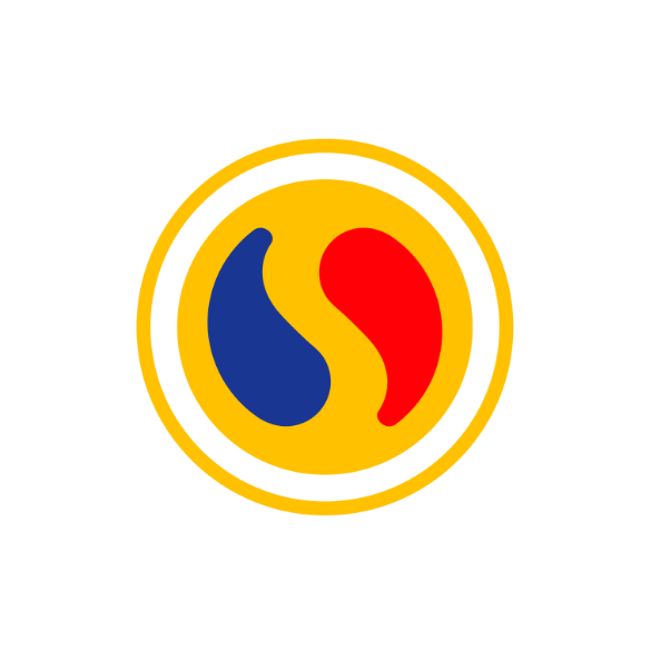
LOGO MARK
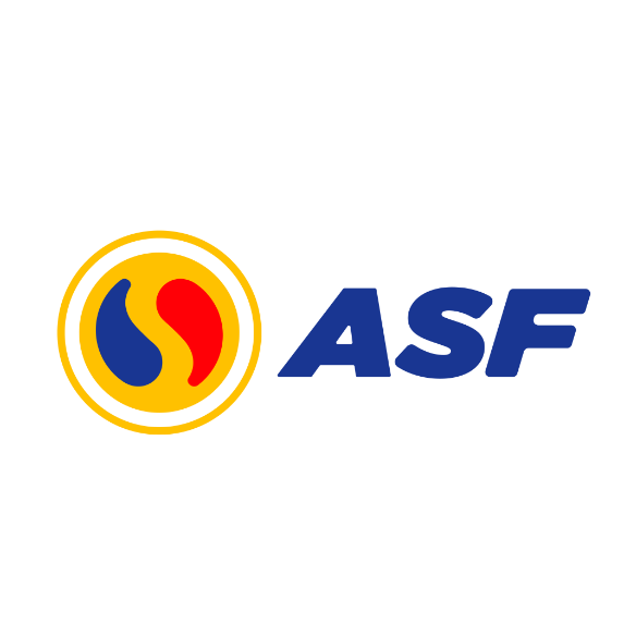
HORIZONTAL
CONFIGURATION
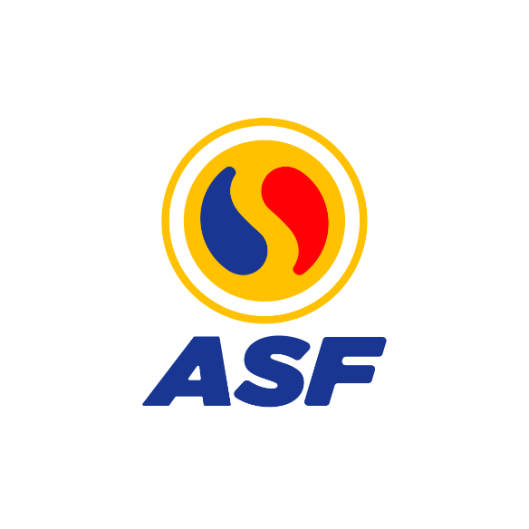
VERTICAL
CONFIGURATION
The outer yellow line symbolises a protective layer around the world of togetherness, which is in turn represented by the inner circle with the blue and red tear drop shapes. The shapes are symbolic of the nature of business wherein there will be ups and downs in one’s journey through entrepreneurship.
Because ASF encourages entrepreneurship among its audience, the symbol is appropriate. The brand name is also shortened to the three letter acronym — ASF.


Let’s Talk!
If what you see here is relevant for you and can help you grow your business or organisation, we’d love to discuss further with you. Drop us a message or schedule an appointment with us.